Thursday, July 31, 2008

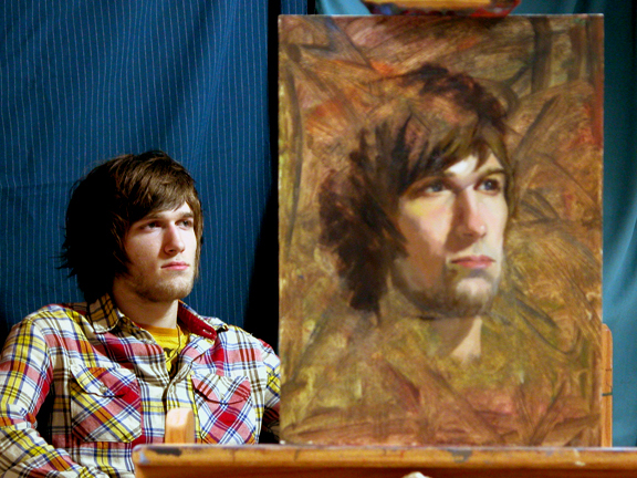
Aron, 18"x14" oil on linen

Aron is an assistant registrar at the Academy who does much of his work behind the scenes.


Aware of the ruddy complexion in his face, I pre-toned a canvas with greenish blue to set his face off with strong color contrast.


I didn't plan to, but I painted from the shadow side of his face. The dominant shadow pattern, the frontal pose in a black shirt, the dark and slightly unkempt hair, and the mustache he's been sporting recently all combined to give the painting a bit of a sinister expression.


Monday, June 30, 2008

Lou Ann, 20"x16" oil on linen

Lou Ann, our guest model for this week, brought with her a couple of scarves to the session, one with multiple blue and red patterns, and the other a simple one of 2 blues. I chose the simpler one and asked her to do something with it on her hair instead of wearing it around her neck. She simply wrapped it around her hair and let the end of it hang in front of her right shoulder.


One thing that is hard to avoid noticing when looking at Lou Ann's face is the brilliant sparkle in her eyes, which I thought was aptly complimented by the bright blues of the scarf. I wanted to express the youthful liveliness of her face in the painting.


I thought the light blue of the scarf could be obtained with cerulean blue, but I didn't have a tube of cerulean blue with me. So I used a mix of cobalt blue and viridian instead to make do.

Tuesday, June 10, 2008

Ed II, 20"x16" oil on linen

Last time Ed posed, I painted his right side in a three-quarter view.
So I decided to paint him from his left side this time. When I found out that it would be a shorter-than-usual session, starting late and ending early, I chose a profile view. I could have added more to the painting after the session ended, but I decided just let it be as it is and give it a more sketchy appearance.

I found a pale violet cloth in the drapery cabinet, which we hardly used before, to use as a backdrop. I didn't like the way it appeared against the undertone of the canvas, so I didn't expand it much beyond Ed’s front contour. The painting turned out to look more youthful than his age. I am sure he didn't mind.

Saturday, May 31, 2008

When the Spring term ended, I wanted to continue the painting sessions through the Summer if there would be enough participation by the students. To my pleasant surprise, 11 students signed up for it! So here we are, painting on!

The major challenge in my part turned out to be coordinating around everyone's class/work/vacation schedule, including mine. So, for the Summer, it will be Wednesday/Friday Painting Club. We will be painting each other on Wednesday mornings. I am lobbying to get the faculty and staff members to pose for us on Friday afternoons.


Steven, 18"x16", oil on linen

It is so nice to paint people with different skin colors, especially people with deep, dark skin, where there is so much color coming out of it that it can easily be overwhelming. The dark tone of Steven's skin and the cool lights on his face were such a delight to paint.
Overall, I like the outcome of this painting: it seems to reflect Steven's quiet and gentle demeanor while still showing the presence of mass of his head.

Friday, May 2, 2008

A few photos from the end of the semester group critique/pizza party
Every participant put up 1-4 paintings for the session.

The guest models, Carol Luc and Lindsay Harmon, also participated in the event. They collected paintings of their choice(of themselves) at the end of the session.

Tough to look pretty while eating in a photo.

Gabriela offering her opinion on one of the paintings.

Vinny concentrating on the pizza.

Thursday, April 10, 2008


Lindsay II, 20"x16", oil on linen

Before the session, I suggested to Lindsay that this time I would like to pose her looking down as if she was reading a book; after all, she is a librarian. She obliged(“I am good at that,” said she).

I started off with her features and planned to spread out to the rest of the head, but I didn't like the way it was developing. So, without completing the features, I reverted back to my usual way of constructing the whole head.

Midway through the painting, I discovered that I had underestimated the size of her head, especially the crown of her head. I think that her having short hair tricked me into not giving enough mass for her head and hair.

At the last stage, I changed my mind and decided to paint in some green from the background to bring out the contour on the front of her head.

Tuesday, March 18, 2008


Carol 20"x16", oil on linen

Carol Luc, our second guest model from the faculty, teaches various design classes and heads the VisCom department.

Carol was very enthusiastic about posing for us and brought as props more than half a dozen hats from her hat collection from times past, mostly the ’50s and ’60s. We chose the blue-and-black beret for today's session and decided to pick another one for the next time she poses for us.

Similar to the last week, I didn't spend much time on the drawing part of the painting at the beginning. Besides, taking pictures and helping a couple of new members get situated during the session didn't leave much time for an elaborate drawing.

I liked the bright color on her face framed between the darks of her beret and sweater. The light lipstick she wore accentuated the sharp angle of her 'Cupid's bow' upper lip and tied in with the intense red background.

I painted the necklace, after the session was over, to suggest the transition between her neck and chest. The deep dark of her sweater could easily blur the boundary between her neck and torso.

Photos of the students and Sarah Kaiser, a Fundamentals class instructor, painting Carol.


Sunday, March 9, 2008

Matt, 18"x14", oil on linen

Contrary to Keith or Spiro, Matt presented with a much gentler transition in the planes of his head, which gave an appearance that probably disguises his actual age. Initially, I painted the shadow plane of his head too dark, with harsh contrast against the light side of his head.

I felt something wasn't quite right until the last stage of the painting, when I realized the mistake. So I re-painted the entire right half of his face in the final 25 minutes. It was a very obvious mistake that I missed.

To go along with the general appearance of his head—gentle contrast between the light and shadow—I painted this painting very thinly and, while being careful not to indiscriminately blend the colors, smoothed out most of the brush strokes with a sable brush once I decided that the right colors were in place.

We used the same red-and-gray background that was carried over from the class because I didn't want to disturb the folds of the drapery that students have been working on for the past 2 weeks. Next week, definitely something other than red will be used as a background color.

Sunday, March 2, 2008

Will, 16"x12", oil on linen

I wanted to show Willユs slightly scruffy look without making him look old or rough. For some reason, at the beginning of painting, I had a hard time seeing the colors on his face. It might have been the light being too close to him or the angle at which I faced him. Looking at the finished painting, Vinnie commented that he looked like a Nascar fan, whatever he meant by that.

Wednesday, February 13, 2008

Sophia, 20"x16", oil on linen

I partially toned the canvas with a mixture of transparent oxide red and viridian diluted with paint thinner and let it run freely. Because I used a canvas with rough surface, I had to thin the mixture with much more paint thinner than I usually use. I used this loose appearance as a background and built the structure of Sophia's head on top of it.

Saturday, February 2, 2008


Tina, 20"x16", oil on linen

Tina Engels is a drawing instructor at the Academy.
A larger-than-usual number of students turned out for the opportunity to paint their teacher.

For this painting, instead of toning the canvas with a neutral tone as I would generally do to start the painting, I chose to use the stark white of the canvas as it was. I wanted the deep dark of her hair and clothes to show a strong contrast in the finished painting.

In the actual setup, she was surrounded by a brilliant blue background, but I decided to keep the intensity of the blue to a minimum in favor of a darker tone that would tie in with her dark hair and black turtleneck.

When she went back up on the stage after the final break, she was a bit confused as to how her black-and-white-striped scarf had been wrapped over her hair before, so she simply let her long hair flow in front of her scarf for the final 25 minutes. I liked this setup better for the long movement her hair created, so I used it to anchor her hair to the bottom of the canvas and created an entry point to her face.

Sunday, January 27, 2008

Keith, 18"x14", oil on linen

Keith is a new member of the club who joined last week, and he agreed to pose for the group in this week's vacant slot. I see him 4 days a week in my class, but once we set the pose I realized how prominent the underlying structure of his head was–clear cut planes of the head, rugged contour of the jaw, broad forehead with pronounced brow ridge and frontal prominences–general characteristics that are often associated with the northern Europeans. He reminded me of characters from the paintings of the great German-American illustrator J. C. Leyendecker. When I asked him later about his ancestry, he said he is German-Norwegian.

Tuesday, January 22, 2008

Ed, 16"x12" oil on linen

This week, Ed volunteered to pose for the group in place of Vinnie, who posed last week.

I stretched a canvas from a new roll of Claessens Type 880, Medium Rough Texture linen that I just bought. It's a rather heavy and rough-textured canvas compared to my usual taste, but I needed a heavy canvas for a large painting I am currently working on, and I wanted to test out its surface quality before I stretch it for the large project.

Unlike Vinnie last week, Ed presented with quite clear planar distinctions of his head structure– more sculptural appearance without the free-flowing locks of hair everywhere, which can be somewhat distracting. Painting Vinnie with all that hair was fun, but it is also a pleasure to paint a head that shows the distinctive structure of the underlying form.

I pulled back the spotlight slightly away from Ed in order to avoid any disturbingly strong highlights on his head. A spotlight can never match the soft natural light, but I wanted to make it as close as I could.

Tuesday, January 15, 2008

"Painting is jealous, and requires the whole man to herself."
— Michelangelo
(How true it is! And he wasn't even a painter!!)


Vinnie,14"x11" oil on linen

For the first session after the winter recess, Marcin Sulewski was to pose for the group, but unfortunately, he didn't return to school for the Spring term. Instead, Vinnie, who was scheduled for the following week, volunteered to pose in Marcin's place.

Before the pose was set, Brian Skol suggested the use of a blue-green drapery for the background, and that worked well to balance the red sweatshirt Vinnie was wearing.

I didn't want Vinnie's thick black glasses frames to be too dominant in the painting, but at the same time, that is how Vinnie looks. The same is true of his hair; I didn't want it to become a distraction from his face, but that is how he is known to us. So I decided to go with the way his glasses and hair look–quite prominent and wildly unkempt. I did add the reflecting lights on his glasses in order to avoid their looking lensless, although they weren't visible from my angle.

As the session moved on to the second hour, Vinnie grew increasingly uncomfortable sitting still. The painting seems to show his growing anxiety from physical discomfort and lack of nicotine intake. One side benefit of students posing for each other is that they get to appreciate the difficult work our models do for us.

Wednesday, December 12, 2007

Anthony,14"x11" oil on linen

Usually, I don't stay with drawing this long when I paintムI do not want to separate the drawing stage and the painting stage too much. Rather, as soon as the general proportion of the head is established and the placement of the features are determined, I move on to lay down shapes of color, including the background. Sometimes, though, I like to indulge myself with the drawing aspect of the painting just a bit longer (I enjoyed the building of this drawing). But at some point I had to decide whether I should go further with "tightening up" this tonal drawing or move on to color. I should have finished this painting as more of a transparent tonal painting rather than a full-fledged painting. It turned out that the next stage of the painting didn't develop to my satisfaction. Looking back, it had to do with the fact that I let myself be distracted by an event that was happening during the sessionムthere was a school holiday event going on at the time involving gallery reception, food, etc.

I took this picture just before I moved on to lay down colors. Later, I scraped the final painting off the canvas for another use, another day.

Friday, December 7, 2007

A few pictures of the students (and an instructor) hard at painting during last week's session.


Sunday, December 2, 2007


Jayce, 16"x12", oil on board


A few days before this week's painting session, I primed a Masonite board with gesso. Onto the second layer of gesso, I created a moderate texture by dragging the brush on the wet surface. After the board was completely dry, I toned it with many random brush strokes using a mixture of mostly transparent oxide red and viridian. I did this to make the background of the final painting suggest the distinctive appearance of Jayce's wildly unkempt hair.
From the beginning, I decided that I would not finish his whole head. Instead, I wanted the color and brushwork surrounding his head to look as if they are a part of him. I started the painting by carefully working on his eyes and made my way down to his nose, mouth and so on. Generally, I would paint the head by first blocking in the larger shapes and then moving on to the smaller details, but sometimes I just want to paint differently. Besides, my main impression of Jayce, particularly from my vantage point, was that of his eyes staring out of the surrounding dark of his hair.