Monday, August 17, 2009

Scenes from the end-of-the-term group critique/pizza party.

We had a few additional guests — some younger than others.

Marcie talking about her painting of Kristen.

Carol giving an advice on composition of Jennifer's painting.

As usual, there were some fun moments mixed with serious critique.

Al with the big smile I mentioned before.

Kristen with both sides of her head.

Marcie posed with her true hair this time.

At the end of the critique, OJ suggested we take a group picture. Too bad some of the participants couldn't come in for the critique, and others had to leave early.

Tuesday, August 11, 2009


Kristen, 14"x11", oil on board

Kristen is Peter Scott's wife, and the proud mother of twin boys.

For this painting, I used a masonite board I sized with rabbit-skin glue and primed with 3 coats of lead-white a few months ago.

When Kristen sat to pose in the beginning, she had her head tilted quite a bit to the left. I thought that was a natural pose she felt comfortable with and expected her to fall back to it even if we adjusted the pose. So I decided to just go with the pose, letting her fall back to her comfortable position after each break.
Maybe because she was too comfortable in the comfy chair, Kristen started showing signs of fatigue early on during the pose. While on a break, she got a Coke and a candy bar to get a jolt. It worked for a while but she continued to struggle.


Expecting there would be considerable movement in her pose throughout the session, I decided to treat this painting more as a spontaneous and "smart" painting than a portrait type head-study. I focused more on capturing her fleeting expression and the impression of her rather than the acute likeness of a still pose.
From the beginning, I painted in a loose manner without defining anything firmly until the later stages of the painting.
To go along with this approach, I kept most of the edges soft with the exception of the bridge of her nose against the dark value of the far eye.

It certainly was a challenge, but in the end this approach also helped to bring out a soft and gentle appearance in her face — according to Kristen, Peter complained about her having a hard look on her face with a frown in the previous session.


Jake, 14"x11", oil on linen

Jake volunteered to pose for the second time this term in place of Tatiana, who couldn't pose for us on her scheduled date due to a work schedule conflict. When he posed the first time in May, I wasn't able to participate, so it was an opportunity for me to catch up. Thanks, Jake!

In this painting, I wanted to pay particular attention to variation of the edges. I tried to carefully discern various edge qualities and avoid any unnecessarily hard edges. Painting a profile against a dark background, it was an interesting challenge to maintain a careful hierarchy of the edges.

In the end, I managed to keep the most of the edges soft and avoid a hard, chiseled appearance. More often than not, when I paint a profile, I tend to be quite drawn to the hard edges of the silhouette, which in itself isn't always a bad thing.

Also, to go along with an overall soft appearance, I downplayed, and even eliminated, a few very strong highlights on his temple, cheekbone and nose.


Maybe because of my care to keep the edges soft, in the painting Jake appears younger than he actually is, with a boyish look.


Tony, 18"x14", oil on linen

Tony is another oil painting major who graduated from the Academy in May. He hadn’t yet gotten to paint during the summer but came in for his turn to pose.

He looked quite different from the last time I saw him at the graduation ceremony. Generally he keeps himself neatly groomed, but after graduation he let his hair and beard grow, looking like a lumberjack or something. Actually, since he is an iron-worker on the side, I thought his rough appearance was an interesting fit for what he does at the construction site.


I pre-toned in a rough and random manner over a lead-white primed Belgian linen canvas with a mixture of transparent oxide red, viridian and cerulean blue just before I saw him come in to the classroom with an unexpected appearance. It turned out to be a appropriate tie-in to his look of the day.


To match with his look and the random pattern of the background, I let most of the brushstrokes stay where they lay without blending or smoothing them, especially on the light side of the head and the texture of his hair.

I saw a very warm red in the middle half of his face, and I think the cool blue specks of highlights on his hair balanced well against the overall warm temperature on his face.


Marcie, 18"x14", oil on linen
Collection of Mrs. Marcella Paddock

Marcie is an oil painting major who graduated from the Academy in May. She has been coming in to paint since last year. I painted Marcie on a Belgian linen that I sized with rabbit-skin glue and then primed with 3 coats of lead-white to give sufficient surface texture.


I must say that, for whatever the reason, I had a rather inauspicious beginning painting her; I can see it in the uneasy brush strokes shown in the first stage of the painting. It might have had something to do with her unusual appearance of having a mass of wildly red wig over her head.

Or maybe I was overwhelmed with many things going on in the pose that I found interesting and was eager to capture them all in a short time — red hair, an earring, a white scarf and the black blouse. But in the end, I was pleased to be able to turn things around and arrive at a satisfying result.


From the beginning of the pose, Marcie kept her lips tightly pulled to the corners of her mouth. I waited to see if she would loosen up later because I was afraid that it might end up giving her an angry expression in the painting. But she managed to keep them tight all throughout the pose.

So I just had to paint the way she looked while trying to avoid an unpleasant expression. I think I was able to do so, though she now has a bit of a determined or even feisty appearance.


Toward the end of the painting, I painted the green backdrop more intensely than it appeared in the set up in order to accentuate her red hair.


Tom Herzberg, seeing the painting the next day, asked me who the "girl" in the painting was. I guess he shared my opinion that Marcie looked in the painting as she might have looked a few years ago, when she was a younger girl.


Jacob, 14"x11" oil on board

Contrary to the case with Al the previous week, looking at Jacob, I saw a much more muted color arrangement in his face. I think it was in part because of his natural skin tone and partially due to the angle of the light falling on his face.
I took it further a bit in trying to organize a muted but clean color harmony.


At times I dislike overly brilliant and vibrant color schemes in figure and portrait paintings, preferring to explore the more "earthy" feel of the skin tone. The challenge is to capture the subtle and narrow color variations while keeping the grays clean and harmonious with the light.


Al, 20"x16", oil on board
Collection of Mr. Alan Luc

Al is Carol Luc's husband, himself a long-time veteran in the creative field as an art director.

From the very first time I met him a number of years ago, I thought Al's face, with his silvery hair, would be interesting to paint. So I've been asking Carol to pose him for us quite some time, but with his busy schedule, it wasn't until this summer that he could finally pose for the club.


I found the red skin tone in his face quite vibrant and lively, especially in contrast with his shiny hair. Looking back, for some reason, I treated the temperature on his face more warmly than it was. Maybe it was because of the cool blue background.


Al turned out looking serious in the painting, unlike his actual personality. I think it's a shame we couldn't paint him in a smile, because I have always thought that Al has a very warm smile that represents his very personable character.


Sara, 14"x11", oil on linen

Collection of Ms. Sara Altieri


Sara is an admissions representative at the Academy. She's been wishing to pose for the club for some time but couldn't do it during the fall or spring term because we had to hold our sessions late in the evening, which conflicted with her commuting schedule. She was one of those people who not only maintained a steady pose throughout the session but also enjoyed posing for the club. It always helps and puts us at ease when the model is not suffering but enjoys posing.


I pre-toned the mounted linen with a warm green mixture of viridian and yellow ocher a day before, so that by the time Sara arrived to pose, the canvas surface was dry with a nice neutral tone.

There was an interesting cool blue reflected light bouncing off her shirt collar onto her jaw. It gave a pleasant contrast against the subtle red just above on her cheek.

I also exaggerated the blue-purple highlights on her hair to compliment her blue eyes and tie in with her shirt color.


The way she wore her hair gave a rather high point to the crown of her head. I suspected the tall height of her head from my particular view might give an illusion of disproportionate head length. So instead of completely enclosing her head with full hair, I decided to just suggest the trajectory of the contour of her head and let it fade into the background.

First session of the summer term.


Generally the summer term at the Academy sees a smaller student body than fall or spring term.

This summer, it turned out that there was a smaller than usual number of students who enrolled for the summer term. With schedule conflicts with vacation, work and class, only 12 out of 28 members were able to sign up to participate during the summer. In fact, the 3 participating students in the first session, Jennifer, Jacob, and OJ, weren't even enrolled in the summer term. (Students who are not enrolled for class during the summer term, as well as the seniors who just graduated last week, are welcome to participate.)


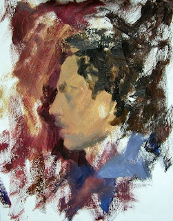
John II, 14"x11", oil on board


I think this was the first time I ever saw John without some kind of hat on. Also, with his unkempt hair, he looked quite different from the look I am used to. It's always interesting to paint someone with an appearance that is different from their usual look.


Many aspects were different in this painting from the one I did of him almost 2 years ago.


Instead of the smooth linen canvas I used to paint him the last time, for this painting, I used a masonite board I primed with thick acrylic gesso. It led me to play with textural effects and bold brush strokes from the beginning of the painting rather than smooth and subtle transition of color and tone. I wanted the rough texture and prominent strokes to enhance the scruffy look he presented. Also, instead of the intense colors and brilliant light in the previous painting, I saw a much muted, but still harmonious, almost gray-blue light on his face.